So there I am driving and thinking about how to lay this out, how to make it most effective for the viewer? How I can tell my story the best way? W. Eugene Smith in his magazine and show layouts took this process to the extreme, he was extremely passionate about his work and tried to layout his story/show for maximum effect, he often worked obsessively to trying design after design for months on end. I will not go to Smith's extremes (few do) but I think I need to have a certain order to the images, a narrative that the person viewing the show can be drawn in by.
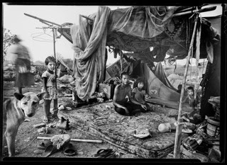
How to start? Was the thought going through my mind as I drove slowly down the slippery freeway. I think the best way would be to start with the children, to show the children first because people will be drawn to that and hopefully it will start the interest that might be held through all 40 photographs (going to try to print 40 -16x20s for this show). If you start out well, then your more likely to hold that attention through the entire exhibit.
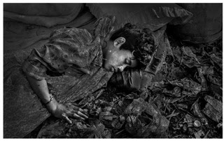
Then I thought, what if I start out with a young boy portrait and then end with a old man portrait? Sort of the ages of man within Klong Toey slum. Think I might do it that way, my initial young man portrait will be this (depending if I can make a good print of this 35mm negative, sharp enough?).

The end photograph showing an old man portrait will be this photograph (am pretty sure I can make a good picture of this large sharp 4x5 negative).

I might also start with one of my 4x5 young boy shots, or the shot of a mother holding her baby also a 4x5 negative if the young boy photograph does not make a good 16x20 print.