Note: I do these reviews for my own personal education, I am hoping that by verbalizing my often confused thoughts : ) I can zero in on becoming a better photographer myself. All comments are directed towards photographs shown in a public gallery any negative comments are written in the spirit of suggestion and self improvement and are not meant as any kind of personal attack on the Artist.
Up Close, Photographers Robert Todrick and Niki Standing at the VAAA until April 5.
Bob Todrick presents a series titled “It’s a wonderful life", the culmination of nine years of what he first considered "family snaps", but suddenly came to the realization that they were much more than that-they were in essence a snapshot of the late 20th and early 21st century culture-not the history of kings and queens, or famines and wars...but a glimpse into the everyday lives of real people at the most personal level.Robert will also be launching his book,"It's a wonderful life", he has published with this collection of photographs and his wife, Chantel's writing and poetry.
I was pleasantly surprised by Bob's work. In the past his photographs have been to artsy fartsy for my taste, I felt that he was trying a bit to hard to create artistic photographs. This time thou I think he is closer to the mark as the work shown seemed more real and more genuine. Because the photographs were more personal there seemed to be a deeper connection, less outright attempts to be an artist creating art and more heartfelt truer emotion.
The 3 best works were:
Ancestors: very nicely printed image that had me thinking in many different directions, a complex work that had a certain universal truth to it.
Swimming Hole : A nice intimate portrait. I thought the print a tad muddy looking thou that could have benefitted if it had been printed with deeper blacks and whiter whites (the version in his book was superior).
Alberta Avenue Kids Waterpark: A fun image to look at with its crossing movement and patterns. Made me glad I was not a parent, hard to keep with those running children!
On the negative side I would have done away with the color work that I thought paled in comparison to the b/w stuff. The matting also had some small over cutting, smudges and even a long dark hair under the glass. I think also the presentation would have benefited if the artist had you used archival board with white core. I did like the brown framing but felt the images were to small and would have looked nicer if printed on 11x14 paper, possibly a nice warm tone fiber paper like Berrger VCCB warmtone glossy.
Several images in the book that was available also featured some good photography. I wish I could have seen printed and framed versions of, old woman holding baby, child on couch with TV (reminded me a bit of Dianne Arbus) and child driving toy car. I think that a selection of these images in 11x14 and the removal of some of the lesser work (especially the color photographs thou the image Arms did have a certain power to it) would have improved the show.
Another thing to consider was to make the show even more personal, more deeply felt. The work of Nan Goldin fits into this category, she holds nothing back and goes all out showing physical, sexual abuse, the death of friends, AIDs suffering, violence and drug addiction. She shows all the deeply personal aspects of her life without censorship. I understand that Mr Todricks life does not contain these disturbing elements but even a deeper personal statement of the happy and sad times would have strengthened the power of his message. Show the tears, the joys, the losses, the boredom, the happy magical moments at a deeper and more intimate personal level. Doing some self portraiture maybe shooting with a 20mm or wider lens to include himself more in the images would also add to the story, after all he is an important part of this personal journey.
Overall I enjoyed his work and am looking forward to seeing the next series,
-----------------------------------------------------------------------------------
Niki Standing's series of photographic works is titled "Illumination man-made objects. This work is about the recognition and appreciation of unconventional beauty. Her work has the recurring theme of marginalization /compartmentalization. Niki explores the overlooked, misunderstood, and oft forgotten-adding an underlying study of memory and public versus private history-leading her audience through their own meditation of who they are and where they fit.
The 3 best images were:
The number 9 button: strangely simple but compelling to look at.
Screw on Green Background: very nice composition and selection of colors that blended well, also somehow simple and sweet to take your time gazing at.
Emergency Button: also direct simple and to the point with colors that seduce the eye.
I felt that the images were a bit to random and disjointed to for my tastes, more commonality between the subject matter would have giving a greater depth to the over all series, It felt like the images were individuals, not really functioning as a team to tell their message.
The presentation worked well thou the sticky tape between the glass frame panels looked messy to me (plastic connectors might have worked better). I think deeper colored images like you get from Cibachromes (not sure you can do anything close to that digitally) would have helped with the visual impact. The lack of print sharpness was also negative, maybe having one extremely sharp point in the image surrounded by soft out of focus elements would have added to the emotional power of the photographs.
The best part of the show was the engaging chandelier of images at the center of the room. The torn paper images back lit with a bare light bulb was very pleasing to the eye and mind.
Not really my type of photography but I would like to have several of these works on my living room wall to study further.
GERRY YAUM'S Photography Website "Tears of a Butterfly"

YAUM PHOTO WEBSITE
AMBROTOS KANATA STORIES BLOG

The 15 Year Ambrotype Project, Telling The Story of Canada
WHY I GO TO THAILAND

Why I visit Thailand often
Gerry Yaum Interview, FRAMES PHOTOGRAPHY MAGAZINE YouTube Channel
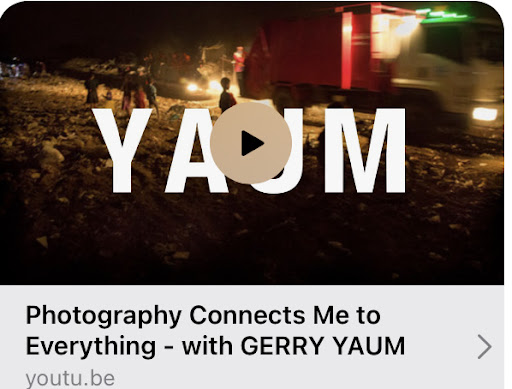
YAUM Interview on FRAMES YouTube Channel
"Black & White" Photography Magazine, Issue #160

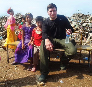
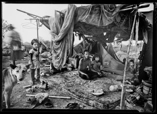
11 Photos, an Interview and the Cover. THE FAMILIES OF THE DUMP and THE PEOPLE WHO LIVE UNDER THE FREEWAY. The cover image is of Khun Oye, 72, Klong Toey Slum, Bangkok, Thailand 2018
BLACK &WHITE Magazine, Layout Feature
THE PEOPLE WHO LIVE UNDER THE FREEWAY and THE FAMILIES OF THE DUMP
CENTRE for BRITISH DOCUMENTARY PHOTOGRAPHY, CBDP

THE PEOPLE WHO LIVE UNDER THE FREEWAY, Khlong Toei Slum Bangkok, Thailand, 2025
St. Albert Gazette MY FATHERS LAST DAYS Story

2017 Story on an Exhibition about the 13 months of my dad life, fighting pancreatic cancer. MY FATHERS LAST DAYS
Me, W. Eugene Smith, Sebastiao Salgado, Lewis Hine and Walker Evans! :) NOT!!!

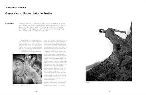
Article From Issue 160 "Black&White" Magazine, on Concerned Photography
LUNCHBOX Radio Interview FOR UNB EXHIBITIONS
Interview for the 2 University of New Brunswick Art Centre Exhitions
UNIVERSITY OF NEW BRUNSWICK EXHIBITIONS VIDEO
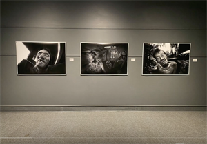
Opening Night Video For THE PEOPLE WHO LIVE UNDER THE FREEWAY and THE FAMILIES OF THE DUMP Exhibitions
Analog Forever Magazine

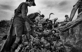
THE FAMILIES OF THE DUMP: Interview and Photos, Online Version of the Published Magazine Story
Asia Photo Review

THE FAMILES OF THE DUMP: Interview and Photographs
Flash Photographic Festival 2022
FAMILIES OF THE DUMP: Story and Photographs
Slate- THE SEX WORKERS OF THAILAND
Photographs and Interview
The Focal Collective

THE PEOPLE WHO LIVE UNDER THE FREEWAY: Photographs and Interview
Vernon Morning Star Newspaper Story

Penticton Art Gallery explores life on the margins of society - Interview And Story
Aquinion Newspaper Interview.
Visualizing Families of the Dump - Photographs and Interview
FRAMES MAGAZINE STORY
LOOK CLOSER: Do we need a photographic code of ethics?
THE FOCAL COLLECTIVE

THE PEOPLE WHO LIVE UNDER THE FREEWAY
UNB Newsletter, THE FAMLIES OF THE DUMP image.

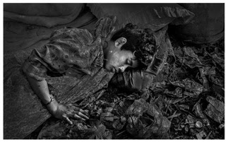
Families working the garbage at night.
THE GRAND PLATINUM PRINT PLAN

My plan for Platinum print exhibitions.
GERRY YAUM'S Documentary Film Making Blog

GERRY YAUM: YouTube Video PHOTOGRAPHY CHANNEL

Shows, photo stories, darkroom work, shooting in the field and fun videos.
GERRY YAUM'S VIMEO Video Page

Gerry Yaum On Facebook

GERRY YAUM FACEBOOK
A BLAST FROM THE PAST
My time in a West Oakland with friends, 1985