Note: I do these reviews for my own personal education, I am hoping that by verbalizing my often confused thoughts : ) I can zero in on becoming a better photographer myself. All comments are directed towards photographs shown in a public gallery any negative comments are written in the spirit of suggestion and self improvement and are not meant as any kind of personal attack on the Artist.
Member 4:
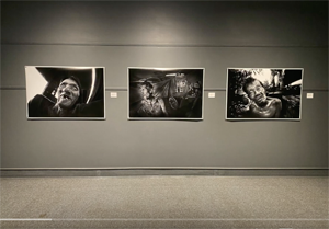
I found this artists work at a much higher level than I did at the last show "Alberta". I was pleasantly surprised at the quality and look of the prints. I guess they were lith prints, but they looked so different than member 3s lith work. I have to learn more about this type of printing, the results can be breathtaking. I thought the framing a bit elaborate and a few of the compositions were a tad postcardish but overall a very good showing by this artist.
Best Images:
Well Aged, Wells Cathedral, UK, 2005
Wonderful looking print with a full range of tones, just fun to look at.
Grand Central Station, New York, USA, 2007
A great sense of place and use of motion. I really felt like I was in the station, also enjoyed the various colored tones. I thought this print was one of the top in the show.
Member 6:
I dumped on this member big time last review and was very pleased to see the higher level of the work he showed this time around. At the "Alberta" show there was much more uneven quality in the photographs, this time around I thought it was consistently at a higher level and enjoyed 2 of his prints quite a bit. I did not really like the print "Reading Chair" that much as I found it rather trite and uninteresting but all the other prints shown were enjoyable to view.
His use of contrast was still a tad high for my tastes (I would dial back 10-20 points) but to each his own, if he enjoys a higher contrast print that's his choice! All the photographs were matted and framed nicely, thou the double mat is a bit elaborate for my tastes. I think also the silver framing does not really work (has a cheapish look) better to go with black frames. Not sure but was "Boat in the Woods" also at the "Alberta" show?
Best Images:
Church Ruins, Bankhead, Banff National Park,2005
A contrasty print that works well with that contrast, well composed with an overall nice composition.
Old Truck,Hanna, 2003
This artists best image. I will include it in my top 10 photos from the show. I thought the choice of lens and camera position worked very well. Got a feeling of times past when looking at the photograph. Good detail and overall sharpness also.
skip to main |
skip to sidebar
I have been thinking of why I love photography, it comes down to something I have labeled "The Three Joys"
1) Creativity
The first joy is simply creating the work. Everything about the making of photographs I love. The initial ideas, the writing on the blog, the preparation of equipment, the research into my subjects, figuring out what I want to communicate. The camera tech stuff like composition, lens selection, cameras, figuring exposure, taking the shot etc. The post darkroom work where you swim with your prints bringing them slowly to life, creating something powerful and beautiful. I love it all.
It is so powerful a thing, you have a idea in your mind, there is nothing else, then YOU make it, you create it, it's fricking awesome stuff.
2) The People
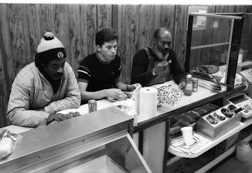
The second joy is that photography has allowed me a way into so many peoples lives, so many different worlds. I get to meet people of all types, speak to them, eat with them, cry and laugh with them. For a while I get to live their existence to be them if you will.
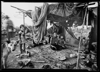
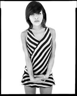
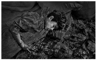
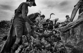
I get to be a child in a slum in Bangkok or a drug addict in a ghetto in Oakland. I get to be a ladyboy sex worker in Pattaya or a man dying of cancer in Canada. Of course I am not really those people but I get a true flavor for those worlds, those experiences, the good and the bad, the ugly and the beautiful, the joy and the sadness.
With photography I get a chance to live outside of the same same everyday meat and potato lives many of my friends and family live. Because I use a camera and make pictures all the doors to a wonderful life experience are open to me, photography is a window into everything!
3) The Photograph
The third joy is about the feeling you get when you accomplish your goals, when you see your final print in the developer, fix or hanging in a gallery. There is a special emotion there, a true satisfied happiness, something so uniquely rewarding. In the darkroom sometimes when I see the finished photo for the first time as it lays in the fixer tray I will let out hoops of joy. I will scream and shout. It is quite a spectacle! It's just the sheer high of that moment bursting out, the YES moment. When the photo is right and you see it for the first time it's the best feeling in the world, better than anything I have ever felt, the high of highs!!
"Ain't Photography Grand!"
"Ain't Photography Grand!!"
Social Documentary Photography for a Better World!
Donation Money Raised to Help "THE PEOPLE IN THE PICTURES"
The total raised through 2 SOCIAL DOCUMENTARY Talks, sits at $560 CAD
Search This Blog
Contact Gerry Yaum
contact@gerryyaum.net
Gerry Yaum Interview, FRAMES PHOTOGRAPHY MAGAZINE YouTube Channel
"Black & White" Photography Magazine, Issue #160
BLACK &WHITE Magazine, Layout Feature
CENTRE for BRITISH DOCUMENTARY PHOTOGRAPHY, CBDP
St. Albert Gazette MY FATHERS LAST DAYS Story
Me, W. Eugene Smith, Sebastiao Salgado, Lewis Hine and Walker Evans! :) NOT!!!
LUNCHBOX Radio Interview FOR UNB EXHIBITIONS
UNIVERSITY OF NEW BRUNSWICK EXHIBITIONS VIDEO
Analog Forever Magazine
Vernon Morning Star Newspaper Story
GERRY YAUM: YouTube Video PHOTOGRAPHY CHANNEL
THE GOAL
To create photographs that speak to the universality, the commonality and the shared humanity of all peoples, regardless of country, race, culture or language.
TRANSLATE YAUM'S PHOTO DIARY INTO YOUR LANGUAGE
Quote: Robert F. Kennedy
“The purpose of life is to contribute in some way to making things better.”
Quote: Nelson Mandela
"As long as poverty, injustice and gross inequality persist in our world, none of us can truly rest."
Quote: Weegee (Authur Fellig)
"Be original and develop your own style, but don't forget above anything and everything else...be human...think...feel. When you find yourself beginning to feel a bond between yourself and the people you photograph, when you laugh and cry with their laughter and tears, you will know your on the right track....Good luck."
Blog Archive
-
▼
2008
(236)
-
▼
March
(32)
- Eight Solos Top Ten List
- Fascinating Book: Image Makers Image Takers
- All Sex Worker 8x10 Film Developed
- Dith Pran an Inspirational Person Dies
- Eight Solos Matting Technique
- Review: Eight Solos Part 5
- Review: Eight Solos Part 4
- Review: Eight Solos Part 3
- Review: Eight Solos Part 2
- Review: Eight Solos Opening Thoughts
- A Fun Day
- The Dangers of Conforming
- Insight From Afar
- 3 Hearts
- Up Close: a Review
- Critiques Why We Should Not Be Afraid
- Philip Jones Griffiths Died Today
- Lawsuit Threatened
- Art Museums - Collecting Photography
- Mono Guild Article
- Gallery Censorship
- Review of Monochrome Guild Photographs
- A Good Photography Blog
- Eugene Atget
- Haunting Photograph
- Alberta-Wide Open Juried Photography Exhibition
- Being Part of a Collection
- Robert Mapplethorpe Biography
- Gerry Yaum Goes Russian!
- All Kinds of Project Ideas
- Adding Sound Bites
- So-pen-nii......6 Faces
-
▼
March
(32)
Total Pageviews
The Three Joys Of Photography
The Three Joys
1) Creativity
The first joy is simply creating the work. Everything about the making of photographs I love. The initial ideas, the writing on the blog, the preparation of equipment, the research into my subjects, figuring out what I want to communicate. The camera tech stuff like composition, lens selection, cameras, figuring exposure, taking the shot etc. The post darkroom work where you swim with your prints bringing them slowly to life, creating something powerful and beautiful. I love it all.
It is so powerful a thing, you have a idea in your mind, there is nothing else, then YOU make it, you create it, it's fricking awesome stuff.
2) The People
The second joy is that photography has allowed me a way into so many peoples lives, so many different worlds. I get to meet people of all types, speak to them, eat with them, cry and laugh with them. For a while I get to live their existence to be them if you will.
I get to be a child in a slum in Bangkok or a drug addict in a ghetto in Oakland. I get to be a ladyboy sex worker in Pattaya or a man dying of cancer in Canada. Of course I am not really those people but I get a true flavor for those worlds, those experiences, the good and the bad, the ugly and the beautiful, the joy and the sadness.
With photography I get a chance to live outside of the same same everyday meat and potato lives many of my friends and family live. Because I use a camera and make pictures all the doors to a wonderful life experience are open to me, photography is a window into everything!
3) The Photograph
The third joy is about the feeling you get when you accomplish your goals, when you see your final print in the developer, fix or hanging in a gallery. There is a special emotion there, a true satisfied happiness, something so uniquely rewarding. In the darkroom sometimes when I see the finished photo for the first time as it lays in the fixer tray I will let out hoops of joy. I will scream and shout. It is quite a spectacle! It's just the sheer high of that moment bursting out, the YES moment. When the photo is right and you see it for the first time it's the best feeling in the world, better than anything I have ever felt, the high of highs!!
"Ain't Photography Grand!"
Contact Gerry
- Gerry Yaum
- Edmonton, Alberta, Canada
- Email Gerry: gerryyaum@gmail.com
"Can a photograph stop a war? Can it save a life? Can it lead to understanding, inspire someone to help, provide comfort and open the door to compassion?
Hope that it can.
Pray that it can."
Hope that it can.
Pray that it can."


