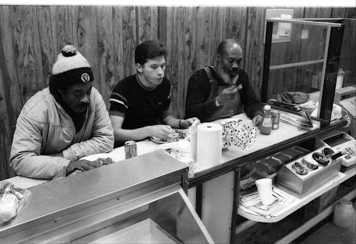
Here is a rough idea of what I might try as the cover for a best of Gerry Yaum photo magazine/book. It will have a black cover, inside there will be black pages mixed with white. All photographs would have the same style titles I place on the blog images, and exhibition famed photos. Not sure about placing those same style titles on the cover pics, will think about that some more. Also not sure if I will capitalize the titles like below either, maybe small letters works better.
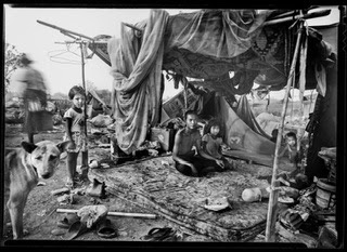
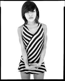
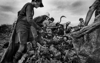
I will probably mix the photos instead of dividing them into sections, I think this will help keep the book browser on their toes. On one page you might have a slum portrait of a old lady the dump, a few pages over it might be a nude portrait of a ladyboy sex worker on white. It is important to show the wide scope of the pics I have made through the years.
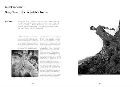
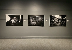
The idea of this book is to give the gallery viewer an opportunity to see a larger body of the work I have created through the years. I get so few shows that I need to take advantage of this chance and display the imagery I have created during my lifetime. This exhibition is to tell dads story and our story together but I need to also take advantage of this situation as best I can. There will be some important Edmonton arts folks visiting this exhibition, I want to make a positive impression (hopefully it will be positive:)))), if at all possible.
This best of Gerry magazine could run as high as 200 pages. I want to flood the gallery visitor with images. Maybe they will not all be great photos but the accumulative effect should tell a larger more important story. Not sure what the max number of pages Blurb mags allow but I will probably go to that upper limit. It will be one image per page with titles, simple straight forward and hopefully quite powerful.
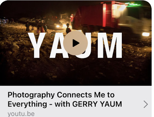
Update* At a later day I will probably publish all the pages of both magazines through screen captures on this blog, stay tuned! I also might do a video run through of the mags on VIMEO.COM like with mags past (see link).
Flipping through Gerry Yaum Picture Magazine
The book will include:
- Colour sex worker images
- Black and White sex worker on white background images
- Direct flash b/w images (like the cover)
- Ladyboy sex worker portraits
- Colour ring flash sex worker images
- 3 hearts images
- Klong Toey slum images
- Muay Thai boxer images
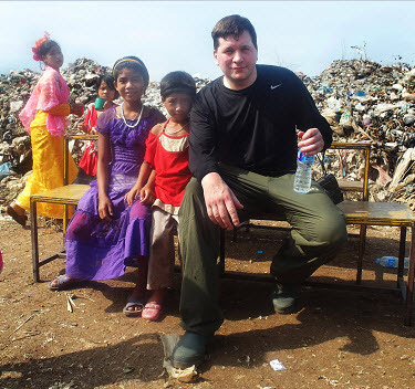
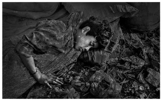
- Mae Sot "Forgotten Laughter" dump images
- "My Fathers Last Days" images
- Images from the past that I like, possibly Oakland ghetto drug use photos (if I can find the negs)
- Self portraits
- General portraits
- Landscapes
- Nudes
Here is the proposed cover, version #1:
Here is cover version #2 with the photo I scanned this morning from the "Forgotten Laughter" project. More compelling? Less? People might be more willing to pick up a magazine with a child on the cover versus the bit harsher portrait Long who worked the sex trade.


