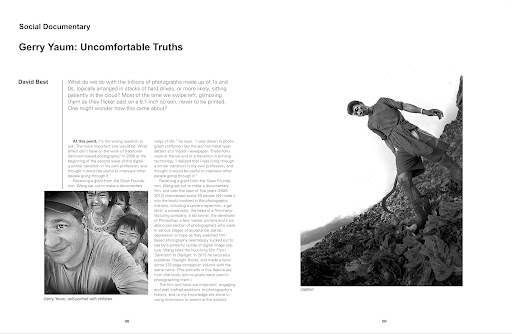
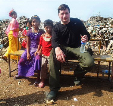
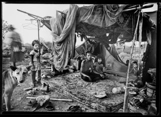
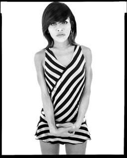
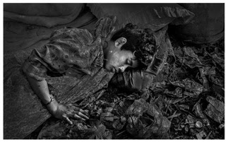
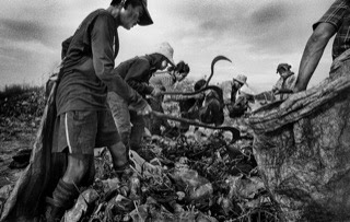
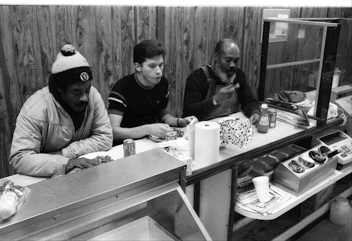
Here is my second attempt at the artist statement. This time the word files were printed on photo quality paper. There is a seam between the 2 mounted sheets but it looks OK. I am quite happy with this 2nd version. I am making up a 3rd version now, printed on a different photo quality paper with the photo placed on the left side this time. I feel the photo adds a nice element, it should give a bit more diversity, interest and add some fun to the exhibition. I always like going to shows that have multiple points of interest, and ways of doing-seeing things.
This show is an improvement in several ways for me personally.
1) I feel the photos are better with a stronger theme
2) The video will add background context
3) 3 magazines allowing for photographic diversity (people can see some of my other work)
4) A better more pro looking artist statements mounted to the wall instead of in a booklet (that no one reads).
5) The framed enlarged contact sheet will add a bit of interesting photo history for the viewer as well as the NAIT class.
6) The 2 poems might also add a bit. I like poetry because it allows you to interpret things in your own mind, based on your own experiences. It is more vague, more general but also can be much more powerful than straight written text. So I count the 2 beginner poems I wrote as a bonus.
7) The two personal colour photos on the artist statements add an important element. I think people will relate a bit more to the situations. They can imagine themselves in the same roles I played.
There will still be no title cards, but I am not sure the exhibit really needs them. I feel the photo should be able to stand on its own, the statement should offer enough info, let the viewer fill in the blanks themselves.
I owe Larry and Joanna a big thank you for allowing me into their gallery and this exhibition, it should be great! I am really looking forward to opening night!! I hope this leads to more general awareness about the lives of my subjects. If I could get some talks out of this I could even spread the word more. I need to concentrate on improving my public speaking.
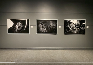
Note* The picture in real life is a bit less dark and contrasty.
 |
| Mae Sot Project "Families of the Dump" Artist Statement version #2 |


